最近做的项目多数是基于Vue的,当遇到绘制图表时候,优先会想到免费开源功能齐全的百度echarts。然而,在vue项目中,引入echarts会有很多繁琐的配置项,数据格式转化等。 无意间发现某大神封装了v-echarts,简单好用,简直是救星!下面具体介绍。
一、介绍
v-echarts是基于Vue2.0和echarts 封装的图表组件。他只需要统一提供一种对前后端都友好的数据格式设置简单的配置项,便可轻松生成常见的图表。
二、使用
npm安装:
1
npm i v-echarts echarts -s
v-echarts图表类型:
1
2
3
4
5
6
7
8
9
10
11
12
|- lib/
|- line.js  -------------- 折线图
|- bar.js  --------------- 条形图
|- histogram.js  --------- 柱状图
|- pie.js  --------------- 饼图
|- ring.js  -------------- 环图
|- funnel.js  ------------ 漏斗图
|- waterfall.js  --------- 瀑布图
|- radar.js  ------------- 雷达图
|- map.js  --------------- 地图
|- bmap.js  -------------- 百度地图
...(更多,参考echarts有的图表)
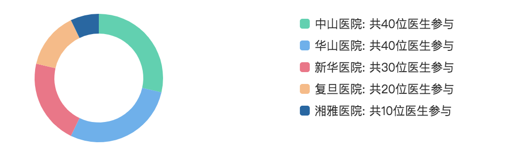
1.基础实例:饼图
1
2
3
4
5
6
7
8
9
10
11
12
13
14
<template>
  <div class="echarts-ring-box">
    <ve-ring
      :data="chartData"
      :settings="chartSettings"
      :tooltip-visible="true"
      height="200px"
      width="500px"
      :extend="chartExtend"
    ></ve-ring>
  </div>
</template>
<script lang="ts" src="./echarts-ring.ts"></script>
<style lang="scss" src="./echarts-ring.scss"></style>
1
2
3
4
5
6
7
8
9
10
11
12
13
14
15
16
17
18
19
20
21
22
23
24
25
26
27
28
29
30
31
32
33
34
35
36
37
38
39
import Vue from 'vue';
import Component from 'vue-class-component';
import VeRing from 'v-charts/lib/ring.common';    // 引入对应图表
@Component({
  props: [],
  components: { VeRing },
  computed: {}
})
export default class EchartsRing extends Vue {
  colors = [
    '#EFB3E6',
    '#FF9F9B',
    '#97D7AC',
    '#c4ccd3'
  ];
  chartSettings = {

  };
	chartData = {
    columns: ['name', 'value'],
    rows: [
      { name: '中山医院', value: 40 },
      { name: '华山医院', value: 40 },
      { name: '新华医院', value: 30 },
      { name: '复旦医院', value: 20 },
      { name: '湘雅医院', value: 10 }
    ]
  };
  chartExtend = {
    series: {
          label: {
            show: false
          },
          center: ['25%', '38%'],
    			radius: ['45%','65%']
  	}
  };
}
1
2
3
4
@import 'v-charts/lib/style.css';  // 一定要引入他的css
.echarts-ring-box {
  width: auto;
}
效果图如下:
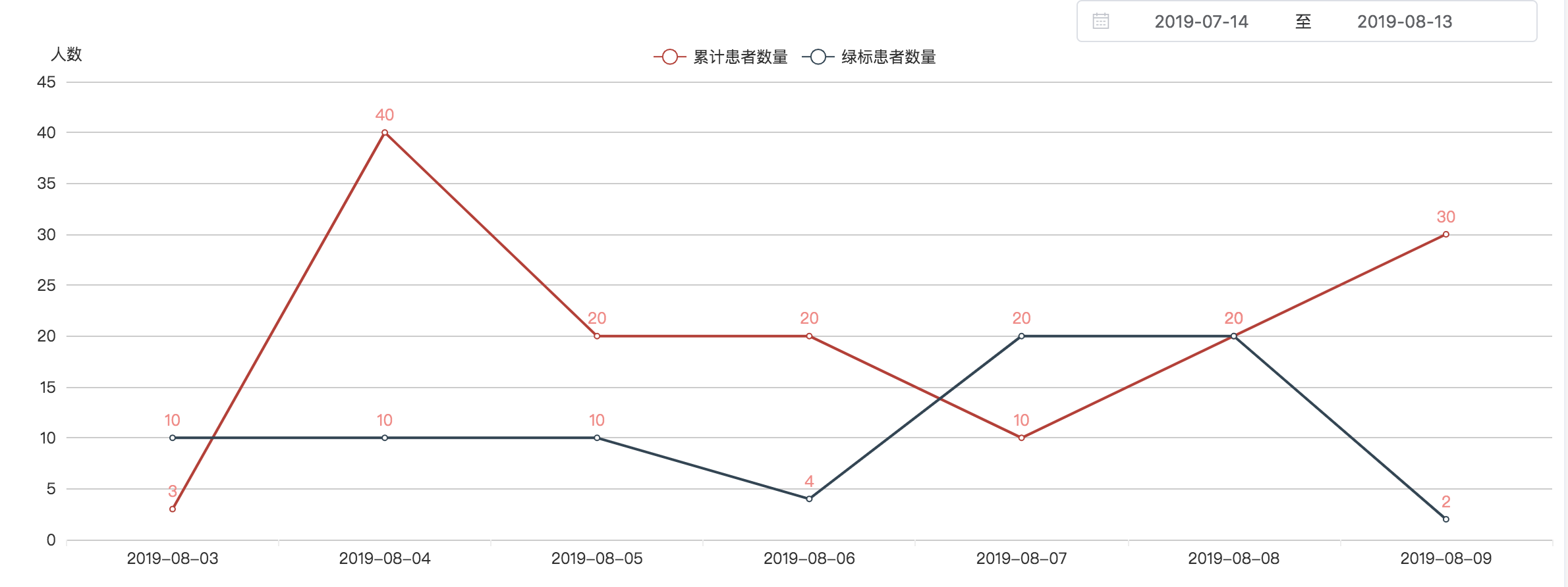
2.传递数据的实例:折线图
1
2
3
4
5
6
7
8
9
10
11
12
13
14
15
16
17
<!-- 折线图组件html -->
<template>
  <div class="echarts-line-box">
    <Veline
      :settings="chartSettings"
      :data="chartData"
      :data-empty="dataEmpty"
      :colors="colors"
      :grid="grid"
      :extend="chartExtend"
      :tooltip-visible="true"
    ></Veline>
  </div>
</template>
<script lang="ts" src="./echarts-line.ts"></script>
<style lang="scss" src="./echarts-line.scss"></style>
上述中data-empty设置暂无数据状态;
extend设置extend配置项;
tooltip-visible是否显示工具栏;
legend-visible设置是否显示图例,默认为true;
chartData为要展示的数据。
1
2
3
4
5
6
7
8
9
10
11
12
13
14
15
16
17
18
19
20
21
22
23
24
25
26
27
28
29
30
31
32
33
34
35
36
37
38
39
40
41
42
43
44
45
46
47
48
49
50
51
52
53
54
55
56
57
58
59
60
61
62
63
64
65
66
67
68
69
70
71
72
73
74
75
76
77
78
79
80
//  折线图组件 ts
import Vue from 'vue';
import Component from 'vue-class-component';
import Veline from 'v-charts/lib/line.common';  // 引入对应图表
@Component({
  props: ['lineChartProps'],    // props传递由父级来的数据
  components: { Veline },
  computed: {
    chartData: function(){      // 赋值 数据
      return this.$props.lineChartProps.data
    },
    dataEmpty: function(){       // 赋值 是否为空
      return this.$props.lineChartProps.dataEmpty
    }
  }
})
export default class EchartLine extends Vue {
  colors = [
    '#c23531',
    '#2f4554',
    '#61a0a8',
    '#d48265',
    '#c4ccd3'
  ];
  grid = {
    show: false,
    top: 30,
    left: 4,
    right: 4,
    bottom: 2
  };
  chartExtend = {  // 一些配置项
    series: {
      type: 'line',
      showSymbol: true,
      smooth: false,
      markPoint: {
        symbol: 'circle'
      },
      itemStyle: {
        normal: {
          label: {
            show: true,
            textStyle: { color: '#FE8685' },
            position: 'outside'
          }
        }
      }
    },
    xAxis: {
      show: true,
      boundaryGap: ['2%', '2%'],
      splitNumber:10,
      axisLine: {
        show: false,
        symbolSize: [10, 8],
        axisTick: {
          show: false
        }
      }
    },
    yAxis: {
      show: true,
      boundaryGap: ['2%', '2%'],
      splitNumber:10,
      axisLine: {
        show: false,
        symbolSize: [10, 8],
        axisTick: {
          show: false
        }
      }
    }
  };
  chartSettings = {
    axisSite: {  },
    xAxisName: ['日期'],     // 设置坐标轴名称
    yAxisName: ['人数']
  };
}
1
2
3
4
5
6
<!-- 使用折线图的页面 html -->
<template>
	<div>
		<EchartLine :lineChartProps = "lineChartInfo"></EchartLine>
	</div>
</template>
1
2
3
4
5
6
7
8
9
10
11
12
13
14
15
16
17
18
19
20
21
22
23
24
25
26
27
28
29
30
31
32
33
34
35
36
//  使用折线图的页面 ts
import Component from 'vue-class-component';
import Vue from 'vue';
import EchartLine from '@/widgets/echarts-line/echarts-line.vue';
@Component({
  components: {
    EchartLine
  }
})
export default class viewPage extends Vue {
   lineChartInfo = {
    data: {
      columns: ['日期', '累计患者数量', '绿标患者数量'],
      rows: [],
    },
    dataEmpty: false
  };
	created(){
    this.getData();
  }
  getData(){
    BusinessService.getData().then(res => {
      // this.lineChartInfo 赋值data和dataEmpty
      if(res.data.list && res.data.list.length > 0) {
        this.lineChartInfo.data.rows = res.data.list.map(item => {
          return { 日期:item.date.slice(0,10),累计患者数量:item.ptCnt, 绿标患者数量: item.greenPtCnt}
        })
      }else {
        this.lineChartInfo.data.rows = [];
        this.lineChartInfo.dataEmpty = true;
      }
    }).catch(err => {
      this.$message.error(err)
    })
  }
}
上述中其他配置项可参考 echarts 官网或者v-echarts 文档官网。
end!